Congrats, SEPTA! You’ve Actually Made a Decent Website
SEPTA Key’s new beta site actually looks ... good?
This SEPTA Key finally has the website it deserves. Photo by Claudia Gavin.
SEPTA Key, the new-ish payment mechanism in which you load your subway fare onto a plastic debit card, has always been something of a contradiction: It’s meant to be a high-tech, digitally-focused replacement for tokens, and yet the website where you fill it with money is so poorly designed it looks like a relic from the early days of AOL dial-up internet.
Apparently, enough people have complained that SEPTA is finally making some changes. Last week, the agency created a brand new beta site for SEPTA Key. Hooray for democracy in action! The new site is a revelation, a revolution, even. Take a look here at the same information presented two different ways:
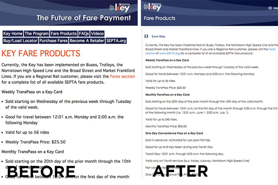
Take a look at the SEPTA Key new website verses the old one. Screenshots via septakey.org.
Early exit polling suggests rave reviews for the new site.
Omg this is so much better! Thank you thank you thank you
— James G (@JGitto) March 15, 2019
I can see my balance on the first page – already an improvement!
— Dave Grizzanti (@dgrizzanti) March 15, 2019
https://twitter.com/alexhillman/status/1106579136838074369
It’s not that unusual to see the public unified in total agreement when it comes to public transportation — the hitch is that the agreement usually takes the form of widespread derision. Amid all of the problems and disagreements a city can have amongst itself, after all, it’s nice to have a bogeyman that everyone can universally despise together. For many years, that was SEPTA.
But lately, SEPTA has undergone a major personality change, stringing together a number of decisions that are positively forward-thinking by its own standards. There’s the new SEPTA Key website; another recent curveball was the welcome news of a redesign of SEPTA’s transit maps, some of which hadn’t been updated since the 1940s. SEPTA apparently got a glimpse of what a modern transit agency looks like — and it likes the picture.
The new site’s still provisional, and SEPTA’s asking for feedback. One warning: The feedback page leads you back to SEPTA’s not-very-good main website. The transition from the sleek key card page to the current site is a bit wince-inducing.
So there’s still room for improvement. But if enough people complain, maybe we can get that site changed, too. It worked once.
Hi Stephanie, unfortunately we received overwhelming customer complaints about the non-beta SEPTA Key site. We've since received many compliments on the beta site. ^AS
— SEPTAKey (@SEPTAKey) March 16, 2019