SEPTA Finally Has Some Maps From the 21st Century
The transit agency has released two map prototypes as part of a push to revitalize the city’s bus system — and it wants to know what you think.
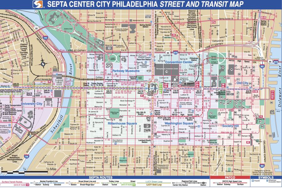
SEPTA’s been around since 1963, and while a good bit has changed over that half-century-long existence, the basic approach of the agency’s transit maps has remained the same. In fact, until two weeks ago, the only map showing the full city bus system was one from the old Philadelphia Transit Company whose design dates to the 1940s — before SEPTA even existed.
But no more! In late February, SEPTA released two entirely new map prototypes — part of a broader push to reemphasize buses amid declining ridership — that are positively futuristic by comparison.
Transit experts say that while the new maps are undoubtedly an upgrade, the old ones, believe it or not, weren’t all that bad:
You be the judge. Is this really a good map?
Set aside aesthetics — not necessarily the forte of urban planning academic types — for a minute. “It used to be, back in day, you’d need high-res transit maps to plan your day,” says Ken Steif, director of the Master of Urban Spatial Analytics program at PennDesign. “You needed to know specific cross streets to get to and had to plan it manually.”
Steif is certainly correct that the hulking Philadelphia full-system map, which includes rail and buses alike, is high-res. One can quibble over whether the brown-paper-bag-colored background and mishmash of pinks and blues make for a compelling visual representation. Steif had a version of this map hanging in his apartment for years, until it began tearing at the folds. To each his own.
The new system-wide map swivels away from its predecessor and toward a minimalist extreme — full of whites and crisp lines. Its design sensibility is more Google computer programmer than Mercator.
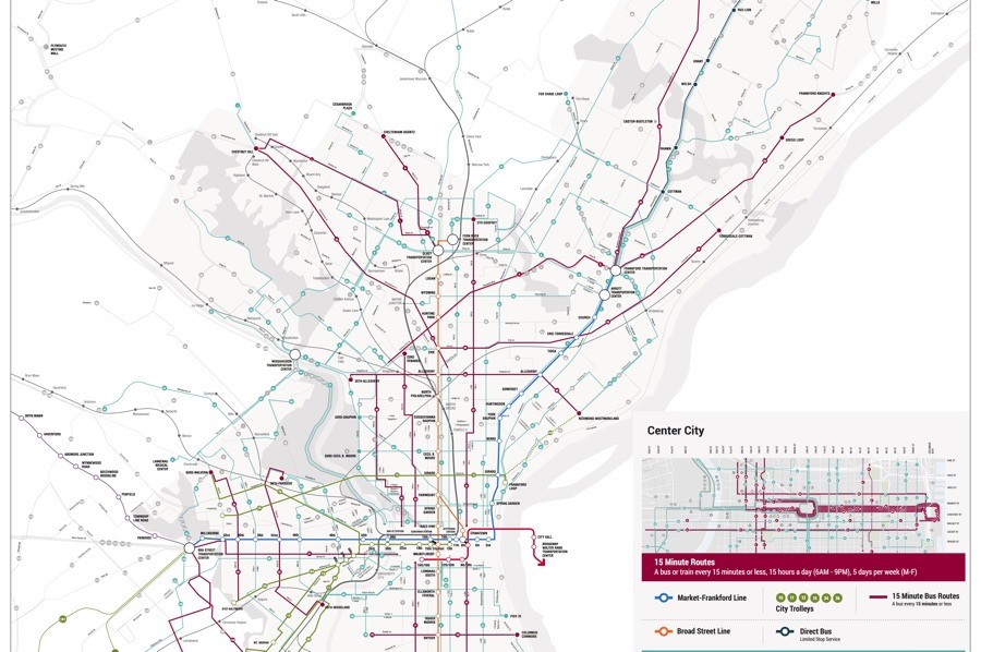
You’ll notice that while the old map emphasized geographic surroundings by including the location of landmarks like Independence Hall and Reading Terminal, SEPTA’s new rendering is less detailed, more abstract. That might sound ill-advised, but it’s actually smart, Steif says. People don’t need a map that tells them where they are in relation to landmarks anymore — technology will do that for them. “This map will be used to complement how people navigate the city with cell phones,” he says.
SEPTA’s second new map, which shows all routes that run every 15 minutes or less, immediately brings to mind the current regional rail and transit map that commands wall space in rail stations across the region. That original dates to 1984, when SEPTA’s regional rail network was consecrated with the connection of Market East (now Jefferson) and Suburban stations.
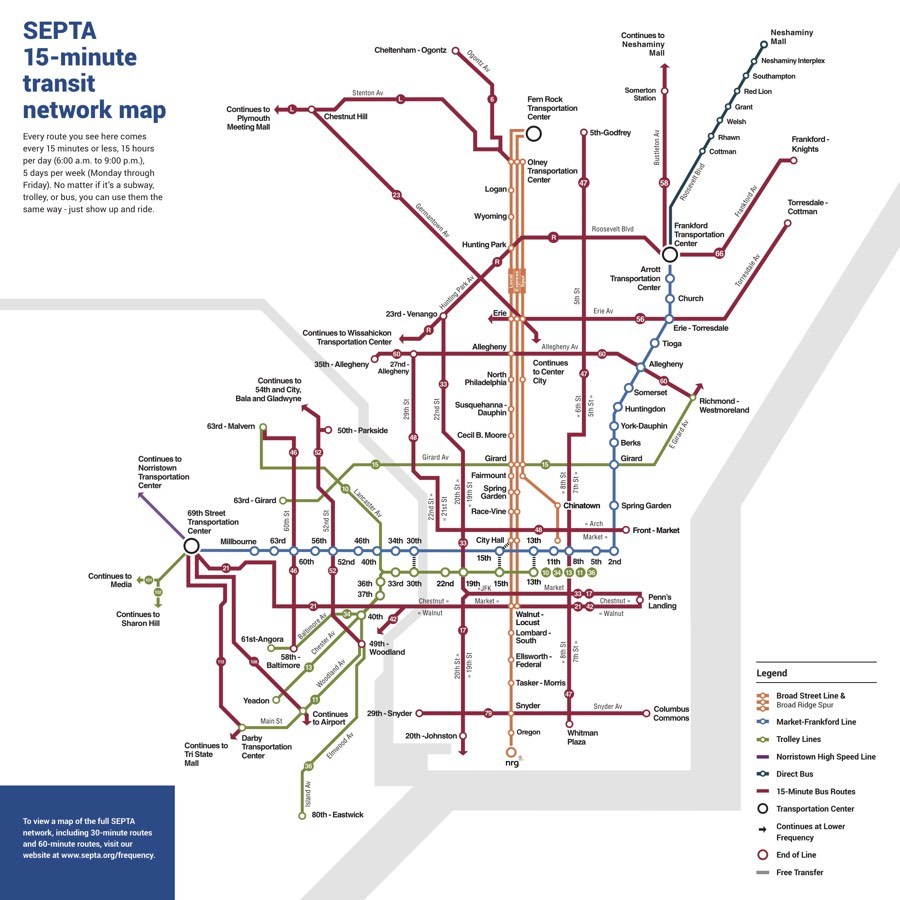
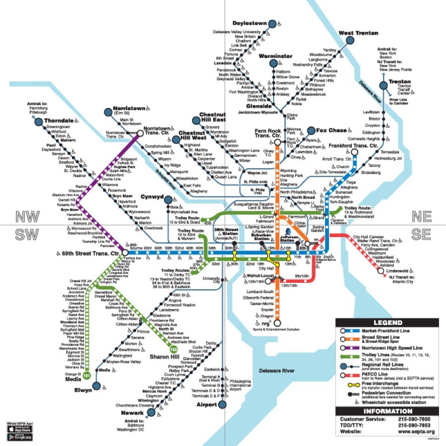
The old map hasn’t been free from criticism, notes Lex Powers, one of the long-range planners at SEPTA involved in the redesign. “The map shows the trolleys disappearing into nothing once they go above ground [at 40th Street],” he says. “It’s the largest light rail network in the U.S., and to not show it is a missed opportunity.”
Academics and transit agency workers like Steif and Powers aren’t the only people engrossed by subway mapping. There’s an entire community of design-oriented folks who like to reimagine better maps of city transit systems. They’ve given face-lifts to New York City, Paris, Washington, D.C. Even Philly! Adam Fisher-Cox, who grew up in Glenside, decided to reimagine SEPTA’s entire mapping and signage for a senior thesis project at Skidmore College. That old regional map just wasn’t up to snuff: “On an aesthetic level it’s one of the uglier maps I’ve seen.” He gives high marks to SEPTA’s new prototypes.
Before you skewer SEPTA for not updating its maps for decades — or ever, really — it’s not the case that all old transit maps are inherently flawed. In fact, Harry Beck’s map for the London Tube, a seminal piece of cartography among subway nerds, has provided the vestigial bone-structure for the Tube ever since its design in 1931. And possibly the most beloved subway mapmaker, an Italian designer named Massimo Vignelli, created a a visionary redesign for the New York City subway in the 1970s. The map, which eschewed geographic accuracy in favor of aesthetics, ended up being scrapped because locals hated it — but to the design world it still represents the pinnacle of transit mapping. (And the NYC subway did at least bring back a version of Vignelli’s design, years later, for a secondary map.)
In any case, the difference between Harry Beck’s Tube map and the old SEPTA maps is that the Beck’s managed to age alongside technology. And it was accepted by the public, which is no small feat, as Vignelli can attest.
Ken Steif, from PennDesign, says it’s not uncommon for locals to hate their own transit map, because they’re not necessarily the intended audience. “It is often not designed for the person living in Philadelphia looking to commute to work every day,” Steif says. “It’s typically designed for someone who’s new to Philadelphia and who may want to see the sights.”
Both of the new SEPTA maps are prototypes, and the agency’s soliciting public feedback — hoping to avoid an NYC-style flop. Eventually, the maps should end up in city stations, not to replace the others entirely, but to provide an addition for the digitally inclined.
SEPTA isn’t stopping there. To combat that declining bus ridership, the agency is considering a dramatic reconfiguration of the actual bus routes. SEPTA officials know that’s an ambitious goal, and a years-long endeavor. As the agency drives forward into the future’s dark tunnel, at least it’s got an up-to-date map to carry along the way.