

Color My World: Bright Color Design Ideas
When choosing colors to decorate a room, we’re sometimes tempted to go with neutral colors because they’re “safe.” Also, it can be tricky to commit to a bright color palette. Though the brightly-colored—and professionally designed—rooms on HGTV look fantastic, we’re often worried we’ll either get sick of the color or we won’t be able to pull it off like the pros. Fear not though, adding bright colors either as the wall color or as accents throughout the room can make for beautiful, unique rooms if you just keep a few things in mind. Before you know it, your whole home may take on a technicolor vibe.
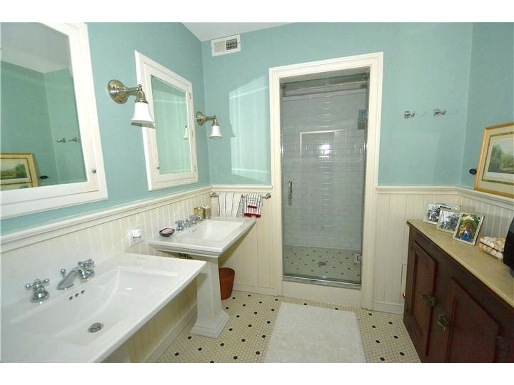
Bright-colored walls can make a statement in a room. If you’re still a little timid, you can try a color in a smaller room like the bathroom or start with just one wall in a larger room and leave the other walls a neutral, coordinating color. Although many paints these days say they have a primer built in to them already, you will want to use a separate primer with brightly pigmented paints—and you’ll want to use a lot. Any color underneath will show through a bright paint, so without at least two to three coats of primer, you may need quite a bit more paint to cover it.
Once the paint has dried on your pretty, vibrant walls and all the furniture is back in its place, you may be tempted to only decorate with black and white to tone down the room. However, choosing a few complimentary colors to accent may work even better. If your bright walls are a warm color, accent with cool colors, and vice versa. And remember: give the color a few months to grow on you. It may be shocking, but after a few months you might just fall in love with it and never want to repaint!
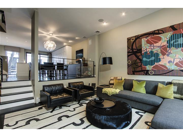
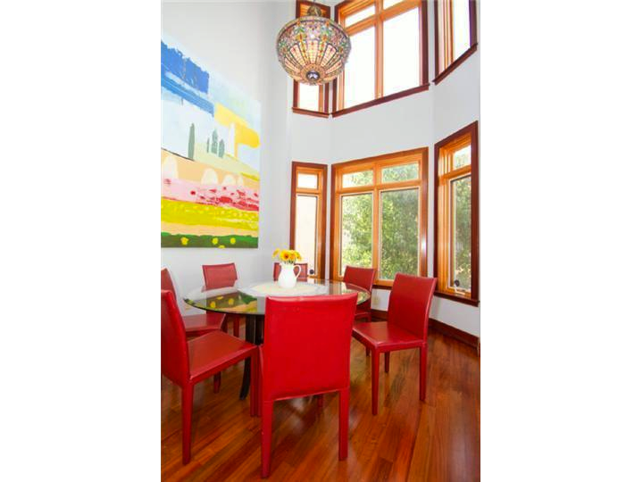
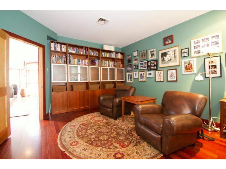
If you don’t want to paint, you can still bring bright colors into a neutral-colored room with accents. Incorporate colorful chairs, throw pillows, wall hangings, artwork, area rugs, flowers, and other tchotchkes. Make sure accent colors are evenly dispersed throughout the room and try to have two or three things that are the same color to keep the theme consistent. If you’re nervous about having a color overload, stick to just one or two hues.
For more bright color design ideas, check out the homes below.
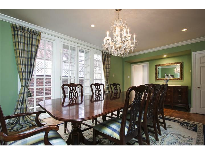
838-840 Lombard St., Philadelphia
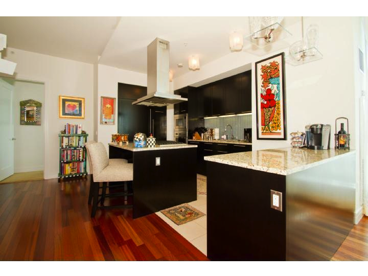
2101 Market St., Philadelphia
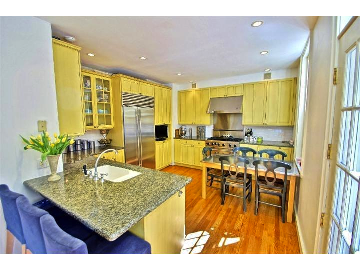
1822 Pine St., Philadelphia
1414 S. Penn Sq., Philadelphia
322 Delancey St., Philadelphia


