


Infographic: What Marriage Equality Looks Like Across the Pond
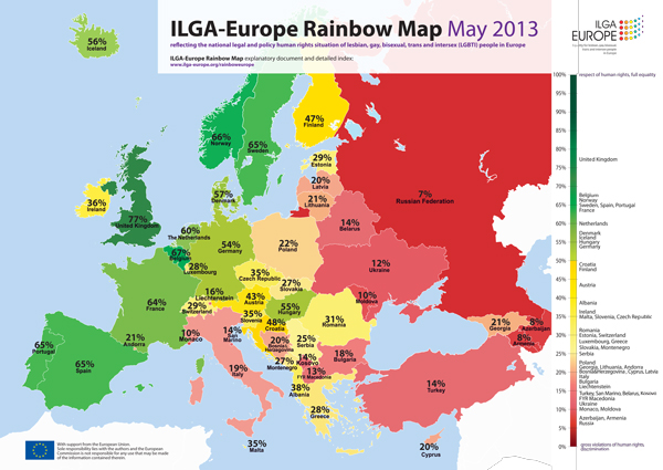
This color-coded map illustrates the status of marriage equality in the 58 European Countries.
Last week I showed you a neat infographic of the current state of marriage equality in the United States. Here’s the European version, published by ILGA-Europe. On this map, green represents one end of the spectrum — the countries that are most accepting of same-sex marriage — while red (hello, Russia) marks those that are most opposed.
Follow G Philly on Twitter | Like G Philly on Facebook | Follow G Philly on Instagram


