
Color Me Happy: 10 Ways to Boost Your Room’s Mood
 Hue won’t believe the summer’s hottest home trend—it’s color! But the brightening benefits of color go beyond aesthetics—they can actually improve your mood.
Color’s emotional improvements are also the inspiration behind Mitchell Gold + Bob Williams’ spring Color Crush collection. “While vacationing in Antigua, I would walk the beach every morning and admire the gorgeous sea glass in vibrant colors,” says Bob Williams. “I collected some of it and let it be an inspiration for our colorful Spring 2018 Collection.”
Bold enough to give color upgrades a try? Read on to see which pops of color to place throughout your home.
Indigo
Blue, especially in deep tones, exude a calming tranquility perfect for places of relaxation, like the bedroom. “Indigo linens, pillows or other accents create a sense of balance in the bedroom,” insists Mitchell Gold + Bob Williams General Manager, Veronica Bay.
White ![]()
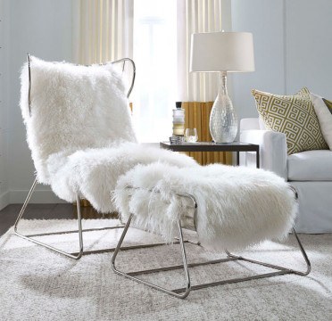
The easiest way to anchor a space? Add a little white accent like the Enzo chair. Its modern metal frame paired with Tibetan wool upholstery make it a total statement-maker. White always provides a fresh yet timeless feel to a home. “The curves of the chair are inspired by Italian race tracks and perfectly angled for incredible comfort—inviting guests to stay a while,” says Bay.
Pink
Pink is now a neutral. “We’re seeing millennial pink pop up in trends everywhere,” says Mitchell Gold + Bob Williams Showroom Manager, Nicholas Bewsey. “It’s no longer gender-specific.” Despite popular belief, pink tones actually pair well with almost any other color. They also add a playful simplicity and bursts of energy to a space.
![]() Shine
Shine
 Shine
ShineSleek space-age inspired accents aren’t necessarily a color but they sure do make a splash. Pieces with a sheen add a sophisticated elegance to a room you just can’t find with any other palette, and are destined to spark a little extra light and happiness. Plus, metallics make a statement without drowning out the room’s other features. They pair well with any color or style.
Peacock
A fun and functional way to infuse a little color is to opt for deep hues like peacock. It adds an unexpected playfulness to your room without the worry of spills staining the surface, shoes on the sofa or furry friends making a mess. Deep jewel tones, like peacock can center a space, especially in a sectional form. “I like sectionals because they make people sit together, not apart,” says Bewsey.
Grey
Grey is the new black, but better. It goes well with everything. “Grey tones are the new traditional,” says Bewsey. “They add a touch of luxury but are still very versatile and livable.” The best part? Grey works wonders adding calm and clean energy to any room—living room, bedroom, kitchen, bathroom.
Prism![]()
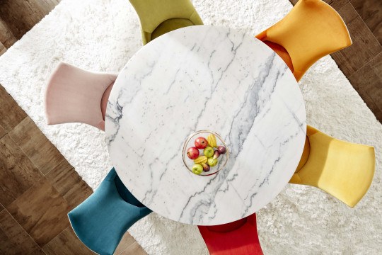
Why choose one color when you can use them all? The Ada chairs encompass every color of the rainbow without overwhelming a space. Prismatic accents add energy to a space, especially one made for entertaining, and the white back piece on each chair creates a clean and cohesive look. “They’re airy, modern, whimsical and a great conversation piece for any room,” says Bewsey.
Clear
That’s right—the lack of color can also impact the feel of a home. Translucent furniture is such a big trend right now. “It’s light, airy and open, welcoming guests in without overpowering a room,” says Bay.
Blue ![]()
Blue patterns are slightly masculine but universal enough to work in any space. The hue presents a clean, clutter-free and always classic look. It perfectly polishes off a room, creating a calm and crisp oasis.
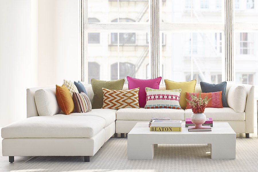
Pops
Not ready to fully immerse your home in color? Opt for accents instead. “Pillows are a great way to update a room without making any drastic changes,” says Bay. “Don’t be afraid to play with not only color but also texture and patterns.”
Add playful pops of color to your space today by visiting Mitchell Gold + Bob Williams at KOP or shop online.
This is a paid partnership between Mitchell Gold + Bob Williams and Philadelphia Magazine
