Other States Have Cool License Plates. Why Can’t Pennsylvania?
It’s been 24 years since we’ve had a redesign. But what should a new PA plate look like?
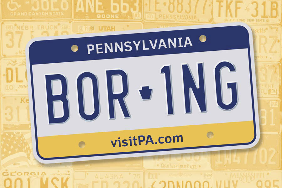
Why are Pennsylvania’s license plates so … blah? / Illustration by Jamie Leary / Background image by Semyon Borisov via Unsplash
“Oooh, mom, look! Nevada!”
I’m driving the family Honda, but traffic has slowed on 20th Street, so I flick my eyes to the right to take in the parked car with its Nevada license plate. “Very cool!” I tell my son, and it is, because you don’t see a lot of Nevada drivers around Philly, and also because it’s a very good plate. I can say that with some authority because for the past year or so — ever since my nine-year-old developed an obsession with the license-plate game — I have, for the first time since I was nine and playing the license-plate game, really looked at the tiny roaming billboards that surround us. This has opened up a whole new world of curiosities.
Here’s one example: Why have I never spent time in Nevada? Heretofore, the state has been little more to me than a sparsely populated word cloud in my brain. (Dam. Desert. Vegas.) But the plate depicts a beautiful snow-dusted mountain range that on closer inspection is actually an artful mosaic of geometric shapes in shades of orange, rust, yellow, green and white, all set against a sky-blue background — like you’re catching the Sierra Nevada at sunset. At the bottom edge sits the rather poetic observation that “Home Means Nevada”; up top, the notched serif font that spells NEVADA nods to the Wild West. A playful Nevada-shaped stamp bisects the alphanumerics. So much character squeezed into such a small space! I can feel my brain reshuffling its Nevada files.
Even given all of this, though, Nevada rarely seems to crack the top five best U.S. license-plate designs, according to people who rank such things. Whose is better? Well, depending on which list you look at — and there are more than you’d think — Colorado, featuring the Rockies etched in shades of white against a forest-green background, is top-notch. Alaska makes a fine showing, too, with its striking palette of blue and mustard, a star-studded state flag squeezed into the middle, and the audacious state motto — “The Last Frontier” — stamped at the bottom. So does Hawaii — a pastel rainbow splashed over plain white, with an “Aloha State” nestled beneath the license number. Other fan favorites include Wyoming (whoa, check out that cowboy on his bucking bronco!) and New Mexico, with a yellow Zia sun design set against bright turquoise.
Depending on how you feel about cowboys or turquoise, you might conclude that a great plate is, like beauty, in the eye of the beholder. But I’d argue that more than good looks, plate greatness rests in creating an impression. Cultivating an image. Giving vibes. You understand: Colorado, like its plate, is green and mountainous and unfussy. It works for Alaska, too: bold! Adventurous! A bit weird! And Hawaii: friendly and noticeably prettier than everyone else.
Then there’s Pennsylvania.
If you had nothing to go on but our plates, you would have … nothing. There’s a lot of white. No particular font. Two pedestrian stripes, one blue and one yellow — like a tribute to Visa, one critic notes on the website Autoblog. In fact, these shades are an allusion to the state flag, which also features blue and yellow, among other colors. (Quick! Can you picture that flag?) An oblique reference, at best.
There’s also no voice there, nothing to cling to. Virginia gets to be for lovers. Idaho mentions its “famous potatoes,” and South Carolina strangely but memorably proclaims, “While I breathe, I hope.” Pennsylvania, on the other hand, has eschewed such frivolities in favor of dull utilitarianism. “VisitPA.com,” our plate lamely commands. But why would anyone want to? The most compelling image on the plate is a tiny, angular hunk of rock. Yes, yes, I know: a keystone, as in “the Keystone State.” Firstly: Yawn. Secondly: Wasn’t the last time you thought about that nickname in your fourth-grade history class?
Which brings us to the real question here, one my plate-obsessed child wistfully posed at the beginning of all of this: Why does everyone, including far lesser states, have cooler license plates than we do? That’s not just our opinion. In the slew of rankings, Pennsylvania is almost always in the bottom five. We’re regularly ranked lower than New Jersey — and rightly so, it pains me to admit. Our neighbor’s plates might be the color of jaundice and sweat stains, but at least there’s some ombré to jazz things up.
So think about it: What does it say about our great state, our very identity, that this — this insipid, uninspired blank slate of a plate — is what we choose to surround ourselves with, what we slap on every resident car before sending it out into the great wide world?
Here’s what you have to understand, Diego Sandino, the press officer for the Pennsylvania Department of Transportation (PennDOT), tells me in an email: “The primary purpose of a license plate is to provide a State-issued, visible and unique alpha-numeric mark for display in a uniform manner on each motor vehicle registered by PennDOT.”
Sandino, whom I only ever converse with over email, answers my questions about plates, tastes and artistic design with (what I take to be) the friendly, firm patience of a first-grade teacher trying to keep a class on task. Our plates, he says, are used for PennDOT business, for law enforcement, for traffic safety. He doesn’t mention vibes.
It’s been a long time — 24 years! — since we’ve had a brand-new design here in PA, so some details about the creative process have been lost to history. Sandino can confirm, however, that PennDOT works with the Department of Corrections on plate design, which must be approved by the governor’s office. (And yes, ours is one of 37 states whose plates are produced by incarcerated people.) PennDOT has “no record or recall” of other options that were discussed, Sandino says — nor is there official recollection of what sort of feedback, if any, this design elicited from the public. (Old op-eds from newspapers across the state, however, give a hint. Like Pottstown’s Republican Herald, for one, where readers’ comments ranged from “aesthetically unappealing” to “just hideous” to “very nice, but what does URL mean?” to “should have went with red, white and blue.”) What Sandino does confirm, though, is that contrast is key, so that “it’s legible in different lighting environments and various weather conditions by both the human eye and electronic license plate readers.”
Reader, what we have here is a failure of imagination. Surely the same could be said of, say, Maine, which still manages to squeeze a chickadee onto its plate. But Sandino informs me that even among the 500 or so alternate military and “special group” plates (like the 4-H one, or the Fraternal Order of Police plates you see), those staid yellow and blue banners mark our Commonwealth’s “family of license plates.” Again, he adds — as if he can tell I’m still thinking about bucking broncos — “PennDOT uses the family of license plate concept since the main purpose of license plates is for vehicle and registration identification.”
Of course, this has always and everywhere been true of license plates, which started popping up with regularity just after the turn of the 20th century. Owners of cars pushed for the plates because regulation meant cars’ recognition as a legitimate form of transit, which meant that carriages would finally have to share the road with them. In the beginning, people made their own, painting initials and numbers on metal or leather or just right on the bumper before eventually shifting to government-issued plates. As with kissing and couture, the standard for official metal plates was actually set by the French: As far back as the 18th century, Louis XVI required them for identification on carriages; by 1901, every car in Paris had to have one. Not long after, the U.S. followed suit, and by 1903, Pennsylvania was issuing its first official state plate.
The design back then was obviously far less sophisticated than today’s models — and definitely harder to read, to Sandino’s point — but also so much cuter, with antique-y fonts that remind you of the house numbers on about half the trinities in South Philly. It didn’t take long — just a couple decades — for more intentional designs and slogans to take hold, as states woke up to the notion that, hey, this was pretty good advertising space. In 2014, Slate’s William Morgan wrote wistfully about the overall decline in American plate design, arguing that the 1920s and 1930s were a high point, replete with “handsome fonts, intriguing logos and state totems.” (In 1928, Idaho’s plate number lived inside the outline of a potato!) In his estimation, the 1970s saw a real dip in plate taste when the reflectorized surfaces made by 3M (which also makes license-plate design software, by the way) started to usurp the old embossed and painted plates, which made for a proliferation of flat multi-color images and cluttered designs. It was, he says, the beginning of a long era of ugly plates.
Not in Pennsylvania, though: We had some real charmers back in the day. The iterations from the 1930s through the ’60s, all bold blues and golden yellows, featured a registration ID nestled inside the border of the Commonwealth — which is, conveniently, roughly the shape of a license plate. The ’70s through the late ’90s saw a series of striking navy blue designs with variations in the yellow type, including one featuring a Liberty Bell and a reminder that we were the “Bicentennial State ’76” and another with the warmly folksy “You’ve got a friend in Pennsylvania” motto.
If you’re the rare soul who engages in conversation with people about license plates, you’ll find there’s real nostalgia out there for these iterations amongst both collectors and just normal Pennsylvanians. My husband is one example of the latter, to my surprise. Not too many years ago, when he spotted a couple of the old plates in a junk pile a neighbor was off-loading, he snatched them up and promptly hung them on the wall of his workshop space. “We spent a lot of time in the car when I was a kid,” he said by way of explanation. Also? “I need some personality and art on that wall.”
Personality! Art! These clearly weren’t top of mind for Governor Tom Ridge, who in 1999 unveiled a new plate — our current design, basically — that would “send a strong and positive signal to all who see it that Pennsylvania is high tech, high energy and ready for the new millennium.” All that would be accomplished, it would seem, by including the state website. Which, okay. We were the first in the nation to do this. Hits to the site quadrupled. Also, it was 1999, the year of Napster and the BlackBerry. A quainter moment, technologically speaking. Who could guess then that just a few years into this new millennium, the main thing a website on a license plate might lead to was questionable road safety? As one friend put it: “I thought we weren’t supposed to be on the phone while we drive.”
So: A quarter-century later, and here we are with the same old plates, albeit with a few tweaks — an update to the web address and stripes with greater opacity. Big whoop. And no, at this moment, there are no plans to change the design, Sandino reports. Which feels like a colossal missed opportunity. Excuse me, more like 11 million colossal missed opportunities statewide. Because while, yes, it goes without saying that we have many (many!) more pressing issues to address, there’s also this: It’s spring now. Rebirth time. There’s a new governor in Harrisburg. New York redesigned its plates in 2019. There, the statewide survey offered to citizens wanting to weigh in on the new design was rumored to be rigged in favor of a depiction of the bridge named for — ha! — then-Governor Cuomo’s dad. Point being: We could do so much better! And in any case, if good public art — or even just good public relations — can uplift citizens the way we know it can, what are we waiting for?
Now for the fun part: What should a Pennsylvania plate look like? Ask your acquaintances this question, and you may find yourself as surprised as I was by the depth and breadth of the answers you get, as if people have been biding their time until they got the chance to suggest a reference to mountain laurel (the state flower), or rivers (“Both Pittsburgh and Philadelphia are shaped by rivers!”), or the color green, to represent our thousands of wooded acres, or simply more keystone. (By the way, here’s a refresher: We’re “the Keystone State” thanks to the crucial role — like the keystone that holds up a stone archway — we played in the founding of the nation.)
You can see how we could easily veer into dangerous design territory: We’re a big state; we contain multitudes. Visual clutter and too much literal imagery is the enemy of a good plate, Slate’s William Morgan says, and also probably the enemy of legibility, which is — I think Sandino would want me to note again — the point here. Assuming, though, that we can safely mesh form and function — that we can produce, as many states have, a plate that’s both workhorse and show pony — we should really first consider the typeface, suggests my friend Michael, a graphic designer who’s worked for Martha Stewart. Our current type, he says, is blah: “No personality.” There’s also a subtle but irritating difference in size between the letters and numbers, which almost definitely was a deliberate choice to do with readability but is, nevertheless, he says, “offensive.”
“Look at Texas’s plate, which is very simple,” Michael directs. Indeed: It’s bright white, with a tidy star in the left corner, winking at “The Lone Star State” plainly declared at the bottom. (Many years back, a plan to label the plates with the moniker “The Friendship State” was scrapped — too “wimpy,” declared then-soon-to-be-governor Ann Richards.) The typeface really stands out — a high-contrast black that’s thick, strong, straight-edged, bold. “It feels like Texas,” Michael says.
I don’t know exactly what sort of typeface might feel like Pennsylvania, but it’s probably like what Justice Potter Stewart said about obscenity: We’ll know it when we see it. Anyway, Michael goes on to suggest that we lean hard into our greatest claim to fame — you know, inventing modern democracy. Maybe, he suggests, it’s time to get back to some Liberty Bell imagery. And color! A copper-colored plate could evoke the bell, he says, as well as nod to our industrial history. Maybe white type, for clean, bright contrast. Maybe some script that gently evokes that of the Constitution. (Hey, 2026 is America’s Semiquincentennial!)
Speaking of proud Philadelphia iconography, one colleague suggested “Give me Gritty or Give Me Death!,” which is cute, though it’s doubtful Pittsburghers would ever sign off on such a thing. And come to think of it, this might be part of our problem. Maybe our plates are so bland not just because of Ridge or the World Wide Web or some deep-seated Quaker instinct toward humility, but because — unlike, say, Texas — nobody here really thinks much about claiming Pennsylvania. I certainly don’t. I’m a Philadelphian, yo. And so are you. Or you’re from Pittsburgh. Or Delco. Or Bucks County, or what have you. This state is so hardwired for provinciality that’s it’s been safest thus far just to stick with keystones and blah white nothingness.
That’s not to say we can’t — and shouldn’t — reconsider this approach. One Buffalo-based plate aficionado named Taylor Cramer, who offers pithy rankings and redesigns for U.S. states and territories on his Instagram (@thetravelingbeardd), suggests that PA plates — he slots ours at number 47, calling it “an absolute snoozefest” — take inspiration from our name. “Penn” we all know, but “sylvania,” from Latin’s sylva, means woods or forest. Cramer’s idea for a glow-up includes a delicate green background of trees with contrasting yellow type, keystone icon intact.
It’s fun to imagine the rollicking statewide debate a new license plate might inspire, whoever designs it. (An artistic citizen? An artistic incarcerated citizen? A statewide contest? Whatever!) It would be a nice change, maybe, a break from all the other, more substantive things we can’t agree on. It might even be a bonding exercise, this project to carve out some sense of shared identity. That’s what this is about, after all. That’s what a good plate can do: clarify, crystallize, even romanticize a bit about who we are, what we like about ourselves, what we want the world to know about us, all telegraphed in a split second on a tiny speeding placard that some nine-year-old somewhere might actually be excited to see, and might even remember and feel nostalgic about someday.
Published as “License to Thrill” in the March 2023 issue of Philadelphia magazine.