


Philly.com Sucks Less, Still Needs Improvement
We spend a lot of time in these parts documenting and lamenting the decline of quality Philadelphia journalism, so let’s celebrate and give credit on the rare occasion it’s due: Philly.com sucks a lot less than it used to.
It’s been about a month now since the redesigned website was unveiled, and if Philly.com has retreated back to some bad habits since then—you’d think Lindsay Lohan lived in Center City for as often as she appears on the local news homepage—the fact is this: It’s a lot easier to find actual news than it used to be.
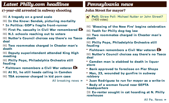
For years, you could go to Philly.com’s “news” page and immediately get lost: There were a couple of photos, yes, but mostly what you saw was what you see in the image above: Tiny-fonted headlines stacked upon tiny-fonted headlines, dozens deep, a visual clutter that made casual news consumption an ugly chore. (For years, I suspected the website was an ugly trick played by the papers to keep their print circulation high. Clearly, that mission failed.)

Now? Most of the main stories get headlines and short summary; many also have a photo thumbnail. It’s not only much more attractive visually—see the image above—but it’s also useful. Readers can more easily judge which stories they want to read and are worth their time. It’s light years better than it used to be.
(On a related note, Philly.com’s iPhone app was also recently relaunched. It had long been the best way to read Philly.com, and now it’s even better—and optimized for the iPad.)
Not everything’s perfect. Nathaniel Popkin of Hidden City Philadelphia recently had a pointed takedown of the still too-vacuous content that tends to dominate Philly.com’s homepage. This comment, in particular, drew blood:
Only about 20 percent of the Inquirer’s readership live in the city and some 20 percent live in South Jersey, figures that explain the Inquirer’s recently renewed push to cover suburban towns. But are 75 percent idiots? That’s about the portion of the content presented on the homepage that is fundamentally vacuous and often aggressively dumb.
One other complaint: Philly.com offers no navigation to the opinion section or its columnists—though you can find both if you remember the old URLs. It appears those sections are being saved for the forthcoming standalone Inquirer and Daily News websites. That’s an understandable choice, but also an unfortunate one for the interim period before those sites launch. And if that is the strategy, it’s not being communicated too well within the papers—Inky columnists Monica Yant Kinney and Daniel Rubin have also publicly questioned their invisibility on the new Philly.com. (And Kinney, of course, has since decided to leave the paper entirely.)
But I’ll be honest: Add the commentary sections back in, and I’d be more than happy to start paying a subscription fee to access this current version Philly.com. The site is finally, finally useful—and if that means that the newspapers and their digital operations are finally ready to start punching back against their own downfall, then that’s even better. Let’s hope this is the start of something good.
The best Philly journalism: The truth is that good journalism still is being done in the city. To cap off the year, we’re looking for your nominees of the city’s best journalism in 2012. There are three criteria: A) The journalism has to be about Philadelphia; B) it has to have helped the audience understand the city better, or C) it has to have demonstrably made the city a better place to live.
All outlets and media—print, online, broadcast, etc.—will be considered. Have some nominees? Email me. We’ll run the selections at the end of this month.

