This Unofficial SEPTA Map Highlights What Riders Really Care About
In much of the city, SEPTA is already convenient: Just head to the bus or trolley stop and a vehicle should show up soon. Map by Thomson Kao.
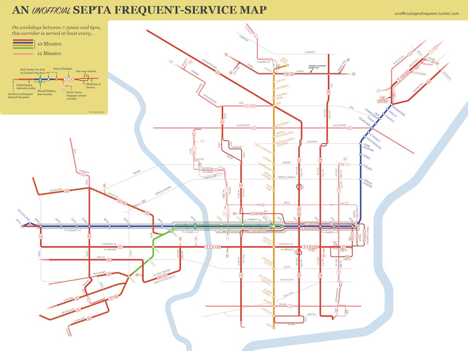
Most transit maps show would-be riders where the buses and trains go. Which is fine, as far as it goes — and if everyone were a mere commuter, maps like these would fill the bill.
But transit users in cities are a different breed. They often use transit not just to get to and from work, but also to get around in general, and for them, how often the buses and trains run often matters much more than where they run.
Frequent transit service also benefits the transit agency by boosting casual ridership. If a rider knows that they can simply walk to a nearby bus stop or train station and get on a vehicle in a matter of minutes, they’re more likely to ride and less likely to drive.
Which is what makes Thomson Kao‘s unofficial SEPTA frequency map so valuable. It shows the corridors where riders can just show up and board a vehicle in fairly short order.
Kao, a project manager for a nonprofit housing developer with a background in city planning and an interest in mass transit, decided to create the map because of the way he and other riders he knew used transit.
“I’ve known for a long time that our transit networks deliver value for people not from the mode they operate but from frequency of service,” he said. Put another way, it matters little whether what shows up runs on steel rails or rubber tires, as long as it shows up soon, and often.
Kao’s map (download a high-res version here) shows the streets in Philadelphia where one can expect this to happen. The thick lines on the map — red for buses, red with green dots for surface trolleys, and color-coded for the light and heavy rail rapid transit routes — indicate where one can expect a vehicle to appear within 10 minutes between the hours of 7:30 a.m. and 6 p.m., the times when the system is most heavily used. The thinner, lighter-colored lines indicate where a vehicle will show within 12 minutes.
If that 12-minute cutoff seems rather arbitrary, you’re not alone: While there’s been no hard and fast research to determine the cutoff point where riders will simply show up at a stop rather than consult a schedule, many transit advocates (this one, for instance) consider 15 minutes the threshold of “frequent” service. “To me, a 10- to 12-minute headway is a good cutoff for a lot of people,” Kao said, “but a lot of people I’ve heard from want to see the 15-minute headways on the map.” Perhaps thinking ahead to its eventual adaptation into a smartphone app, he added, “Maybe you could have an app where you could turn that on and off, but right now, I chose not to have that.”
Equally important is that the map is corridor- and not route-based. While many SEPTA bus routes run frequently enough throughout the day that they form their own high-frequency corridors — routes 23, 33, 45, 47, 66 and the subway-surface trolleys all qualify, for example — other corridors achieve high-frequency service only when you combine the headways for all the buses that operate on it. A good stretch of Roosevelt Boulevard in the Northeast, for instance, becomes a high-frequency corridor only when you combine the headways of the two or three routes that operate along it.
Kao developed his low-tech graphic using a little high-tech wizardry. “I took the raw SEPTA data that powers the transit directions in Google Maps and put it in a database that queried each stop and said, ‘Give me all the times a bus comes to that stop in sequence. Then look at all the headways between those buses. If you find no more than 10 minutes between buses, flag it for inclusion.'” He then did the same for stops with 12-minute headways, plotted the data onto a GIS map and color-coded the corridors.
One advantage of setting 12 minutes as the cutoff is a map that is easier to read. As Kao put it, “We’re lucky in Philadelphia that we have many routes that operate at 10- to 12-minute intervals, so you can make a clear map out of it.” Many more routes operate at 15-minute headways during the day, which would make the map more cluttered, he points out.
Kao sees this map not only as a useful bit of information for the rider but as the springboard for a policy discussion. For instance, take one of Kao’s high-frequency corridors, Olney Avenue in upper North Philadelphia (pictured). The map labels this as a high-frequency corridor only in the westbound direction; that’s because while the two lines that run along the street both operate at 15-minute headways, their westbound trips are staggered while their eastbound runs are in sync. Would a schedule tweak to produce sub-10-minute headways in both directions boost ridership? Kao doesn’t know the answer, but he wanted to ask the question: “I wanted to start a conversation around policies and service planning,” he said. “Are we making this system as efficient as possible?”
Another thing the map makes clear is that investments in more frequent bus service might just have a big return for modest cost.”Buses shouldn’t be treated as an afterthought that doesn’t deserve investment just because it doesn’t run on a rail,” he said.
So far, SEPTA has not yet expressed interest in making this unofficial map official, Kao said. But who knows? If the unofficial map gets wide enough distribution, the agency might want to consider that possibility.
Follow Sandy Smith on Twitter.