Gray Areas: The Color Dominating Home Design
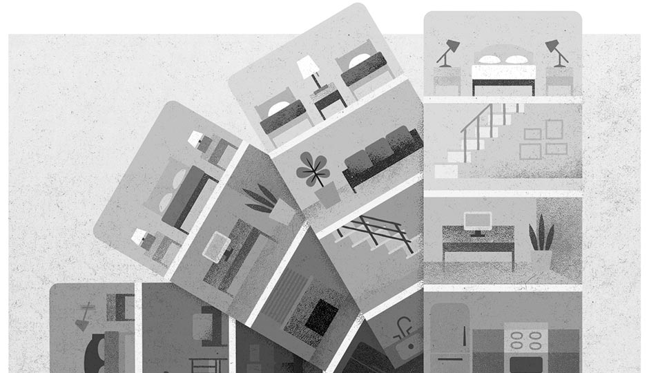
Illustration by Melissa McFeeters
When did the insides of Philly homes start resembling the skies over Seattle?
I can’t say for sure, but for some years now, gray has been the color of choice for a lot of builders and owners. Like open-plan main floors, grayness has become ubiquitous in new homes, especially in the city. And it’s not just any gray; a specific spectrum of bluish-grays has taken over design — shades builders like to use and layer because they tend to work with just about anything.
As Philly designer Mona Ross Berman says, “They’re really a natural successor to the beige of the ’80s and ’90s — very neutral and unlikely to offend any potential buyers or friends or mothers-in-law.” They’re even more attractive because of their ability to change character depending on the time of day: “They’re a little more interesting and nuanced than beige.”
Of course, this isn’t the first time the design world has worked itself into a lather over something so seemingly, well, neutral. And gray’s popularity might not be just a matter of the way certain colors are believed to affect moods. (Soft, cool colors are thought to be soothing — and who doesn’t need a little soothing these days?) It also comes down to pragmatism: According to Zillow, color choice makes a noticeable difference in sale price. Recent research from the real estate company showed, for instance, that soft blues or blue-gray tones in the kitchen alone up a home’s value by $1,800, while more dated colors hurt sale prices. (Who wants avocado appliances anymore?)
But even as we realize the ubiquity of these steely neutrals, the design ship appears to be steering away. Havertown designer Michelle Gage says she makes a point of avoiding the gray-box look: “I’m all for adding a kick of color to your walls.” Paint manufacturers, too, are starting to favor darker, warmer hues: purple, green, yellow, copper, even black. (A few first picks from paint companies for their “Color of the Year” for 2018: Behr’s blue-green In the Moment and PPG’s indigo-spiced Black Flame.)
Berman suggests that the slow rise of warmer browns and deep blue-blacks has to do with a desire among younger homeowners for authenticity and originality. “Warmer and darker shades are dramatic and very quickly convey a point of view and message,” she says. “Generic, popular and safe are not tags they respond to and are in opposition to their desire to self-define.”
Well, maybe. Consider Sherwin-Williams’s 2017 color of the year: taupe, which seems, frankly, to have all the personality and drama of gray. But at least it hasn’t been done to death. Yet.
Published as “Gray Areas” in the October 2017 issue of Philadelphia magazine.