Philadelphia Is in Top 10 Most Unequal Metros
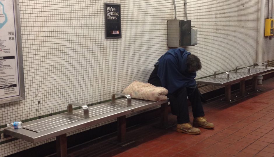
Photo: Liz Spikol
Writing for Trulia Trends and The Atlantic Cities, Trulia’s CEO Jed Kolko says what the Occupy movement brought to mainstream consciousness, even as everyone derided those who soapboxed the message: “Income inequality has been growing in America, driven by technology, globalization, and other factors. It’s caused tensions between the haves and have-nots, which often get played out at the local level, and these tensions have erupted into fights over housing affordability and public services.”
Kolko examines income inequality in the 100 largest metros for the years 2012, 2006, 2000, and 1990. Based on collected Census data, Kolko finds that the Philadelphia metro’s rich-poor gap is in the top 10 — No. 7, to be exact. Here’s a chart:
Where Income Inequality Is Highest | ||
| # | U.S. Metro | 90/10 ratio, 2012 |
| 1 | Fairfield County, CT | 18.5 |
| 2 | San Francisco, CA | 17.9 |
| 3 | New York, NY-NJ | 17.7 |
| 4 | Boston, MA | 16.2 |
| 5 | Detroit, MI | 15.2 |
| 6 | Miami, FL | 15.1 |
| 7 | Philadelphia, PA | 14.7 |
| 8 | Springfield, MA | 14.2 |
| 9 | Peabody, MA | 14.0 |
| 10 | Toledo, OH | 13.9 |
| Note: the 90/10 ratio is the ratio of income at the 90th percentile to income at the 10th percentile, for a given metro. A higher ratio means greater income inequality. For the 90/10 ratio for the 100 largest metros, click here. | ||
Interestingly, Allentown fares quite well, ranked No. 2 of the 10 metros where income inequality is lowest.
One of the quirks of Philadelphia’s numbers is that inequality is often powerfully linked to housing affordability. But:
…there are many exceptions to this pattern: Detroit, Toledo, New Orleans, and Philadelphia are also quite unequal but are relatively affordable, and on the flip side, Ventura County, Orange County, and Honolulu are more equal but far less affordable.

• America’s Most Unequal Metros [The Atlantic Cities]